스터디장님의 가이드가 좋았던 17기 figma 스터디 사례글

2025.07.12
결과물:
https://big-aged-78842708.figma.site/
제가 UX/UI를 아예 몰라서 수행한 내용을 순서대로 적어보겠습니다.
이해가 쌓일수록 꿀팁을 주셨기에 자연스럽게 수업에서 나온 팁들을 역순으로 수행하게 되었습니다.
모두의 UX 진단소
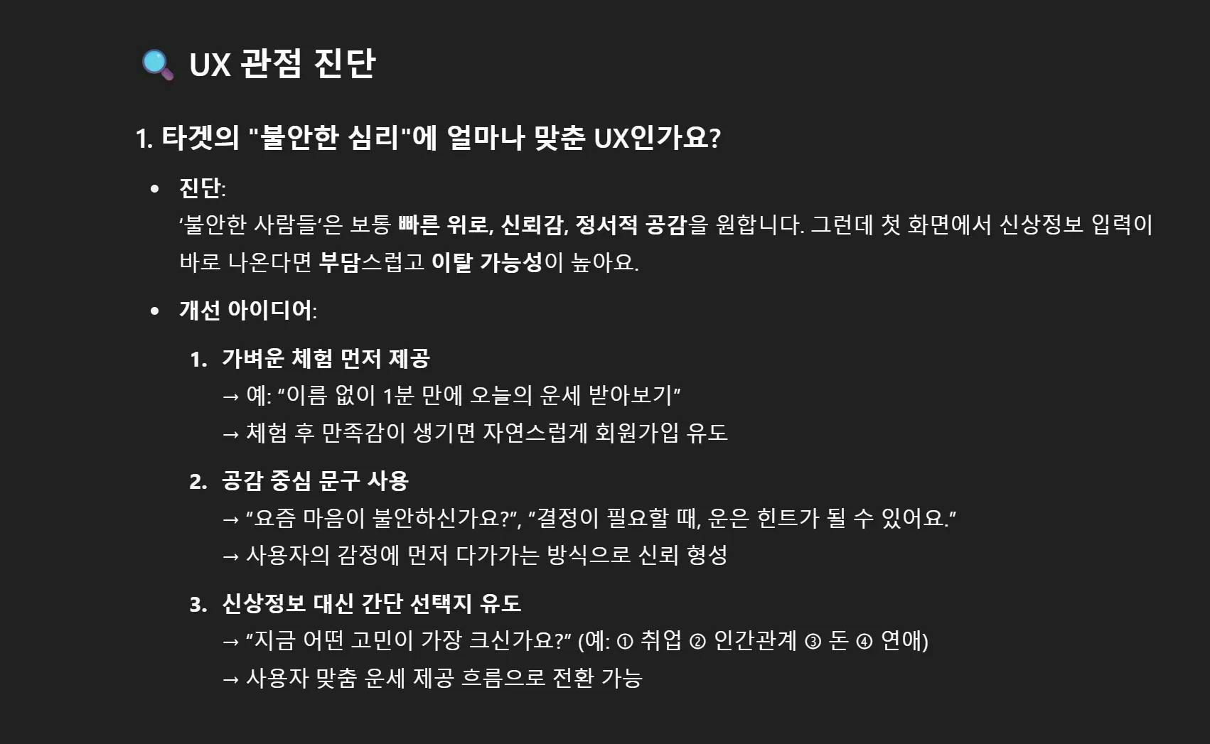
공개범위를 몰라서 일부만 편집해 올리자면, 저는 UX UI에 대해 모르지만 GPT를 자주 사용했기에, 예상되는 답변이 있었습니다. 그러나 스터디장님이 커스텀하신 UX 진단소는 제가 생각하지 못한 명쾌한 해답을 줬기에 신선하고 좋았습니다.
UX/UI Builder
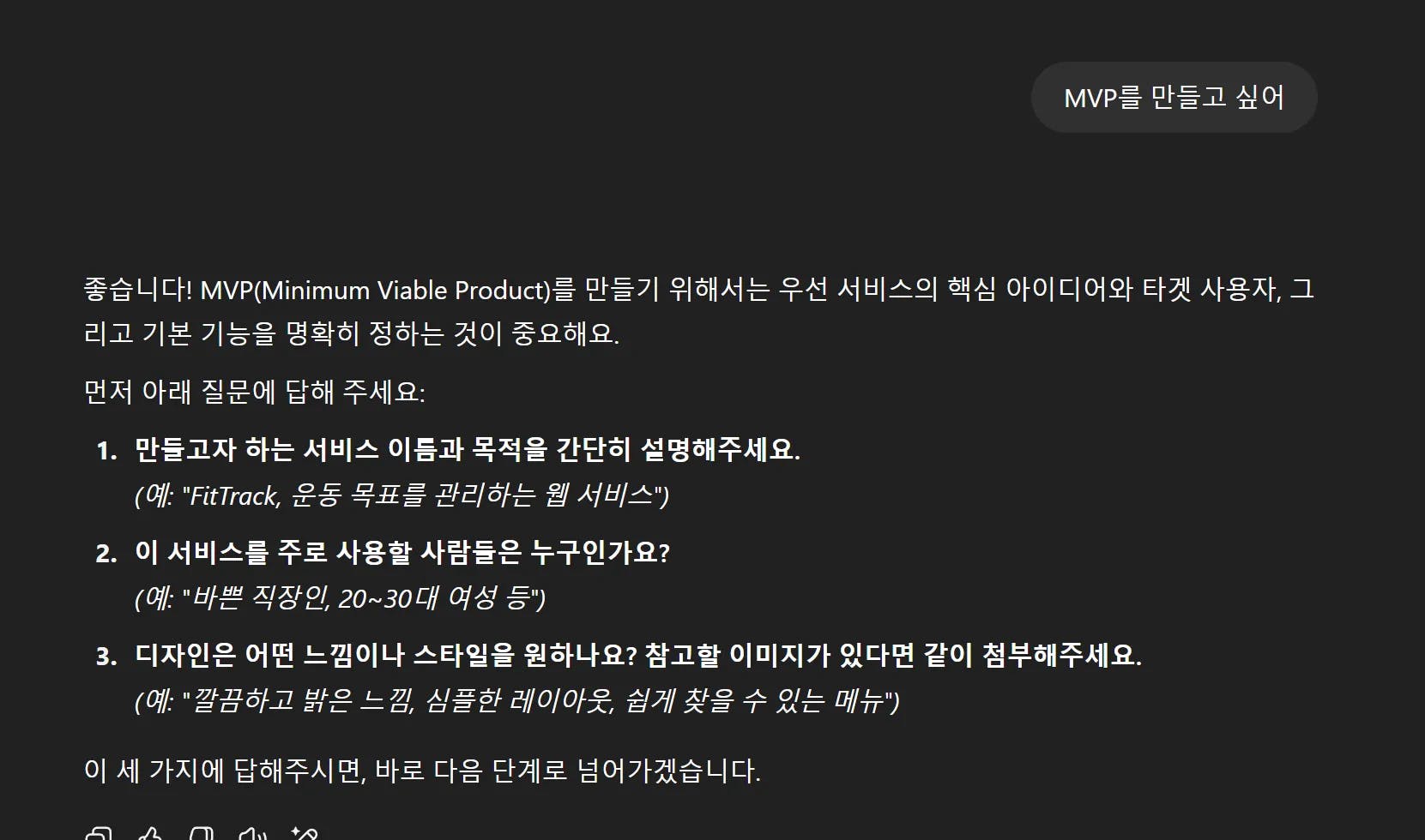
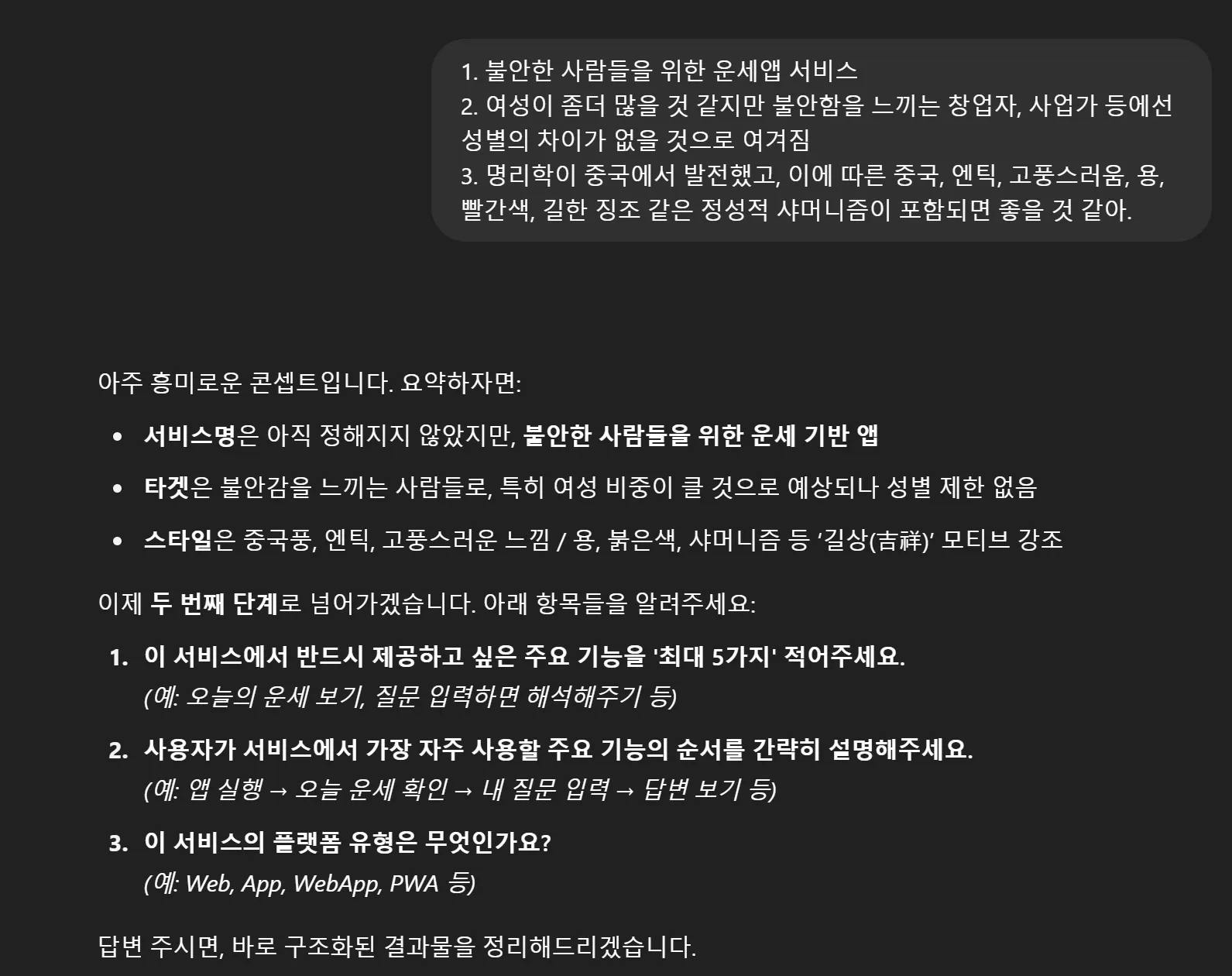
이 역시 스터디장이신 Diane님께서 커스텀한 GPT입니다. 제가 심미안에 자신이 없었기에 프롬프트가 시키는 대로 할 생각이었는데, 가이드가 있으니 좋았습니다.
Figma Make
출력물을 그대로 Figma Make에 넣었습니다.
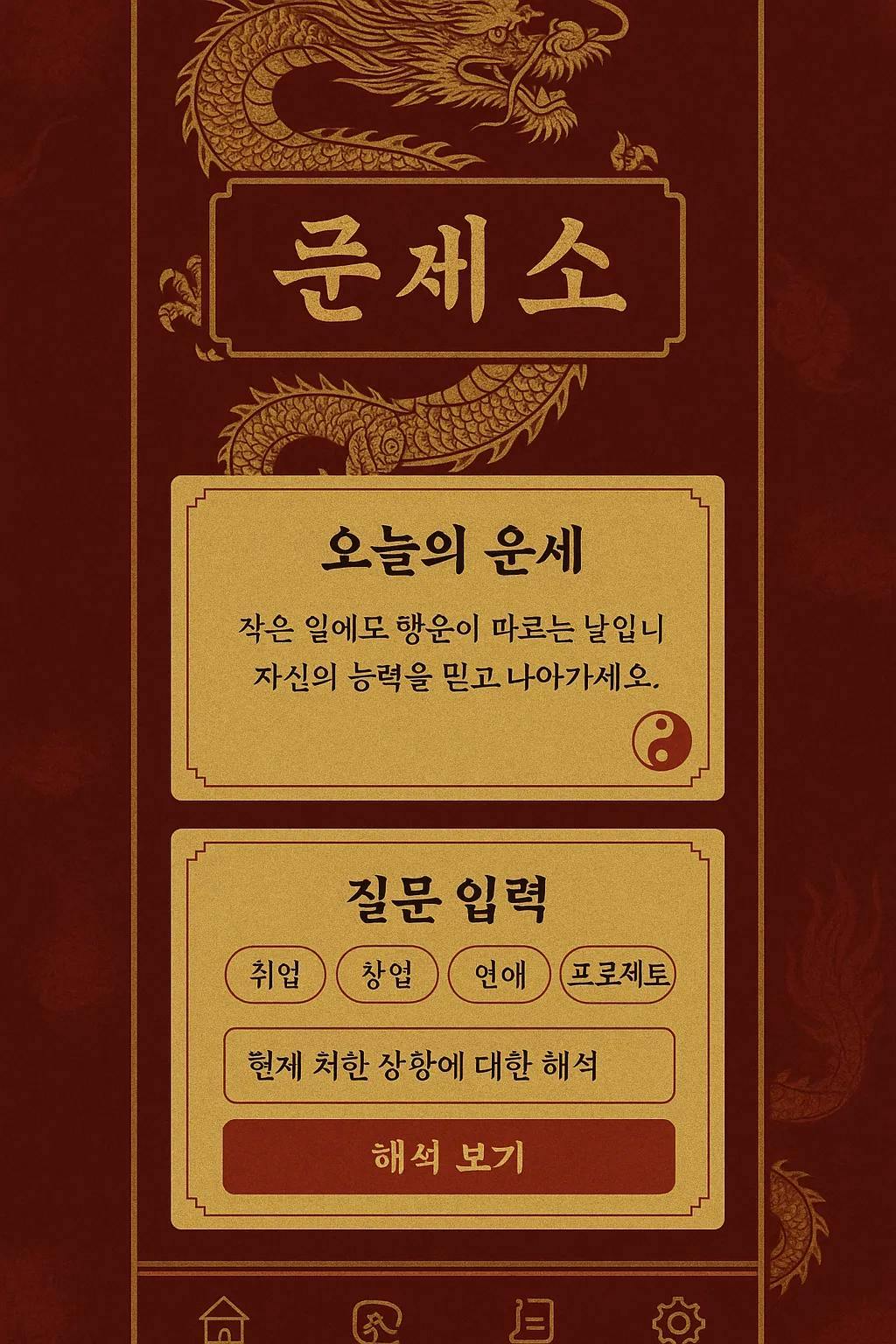
컨셉 이미지가 맘에들어서 이미지와 연관된 프롬프트를 다시 짜달라고 했습니다.
UI / Visual Design Prompt (for “운세소”)
Reference Image: #ref_image ← attach the dragon / red-gold antique mock-up here
• Task: Design a WebApp / App interface for a fortune-telling service called “운세소”.
• Target Users: People who feel anxious (e.g., founders, entrepreneurs, career-changers).
• Core Mood: Chinese-inspired antique aesthetic with strong symbols of luck.
• Must-have Visual Motifs: golden dragon, red-and-gold palette (#8B0000 / #FFD700), silk textures, parchment cards, calligraphic brush typography.
• Avoid: modern “startup-style” UI (no flat pastel blues, no glossy gradients, no playful rounded icons).
• Navigation: bottom-tab bar, 5 icons (Home, Ask, Response, Dream, History) using Eastern spiritual glyphs.
• Animations: subtle fluttering flame on Home fortune card, scroll-unroll transition when showing responses.
Key Screens & Components
Home – “Today’s Fortune” scroll-like card (uses colors & typography from #ref_image).
Ask a Question – stepper: select anxious topic → text input → “Get Insight” button (crimson with gold bevel).
Response – parchment card that displays LLM-generated advice. Include small yin-yang stamp bottom-right.
Dream Interpretation – input dream keywords, result appears as stamped dream scroll.
History View – vertical timeline of past questions; each entry uses mini parchment chips.
Design Constraints
Use the reference image (#ref_image) for overall color balance, texture feel, border style, and icon strokes.
• Background: deep red woven-silk texture; overlay faint dragon watermark.
• Typography Pairing: Traditional serif/brush headline + legible modern sans body (e.g., Noto Serif KR + Noto Sans KR).
• Touch Targets: ≥ 48 px; maintain high contrast for accessibility (WCAG AA).
Deliverables
High-fidelity mock-ups (Figma frames 390 × 844 and 1440 × 1024).
• Design tokens: colors, fonts, radius, shadows.
• Motion spec (GIF or Lottie) for flame & scroll animations.
Use #ref_image as the primary style reference. Sample components should visually match its ornate borders, gold linework, and aged-paper texture.
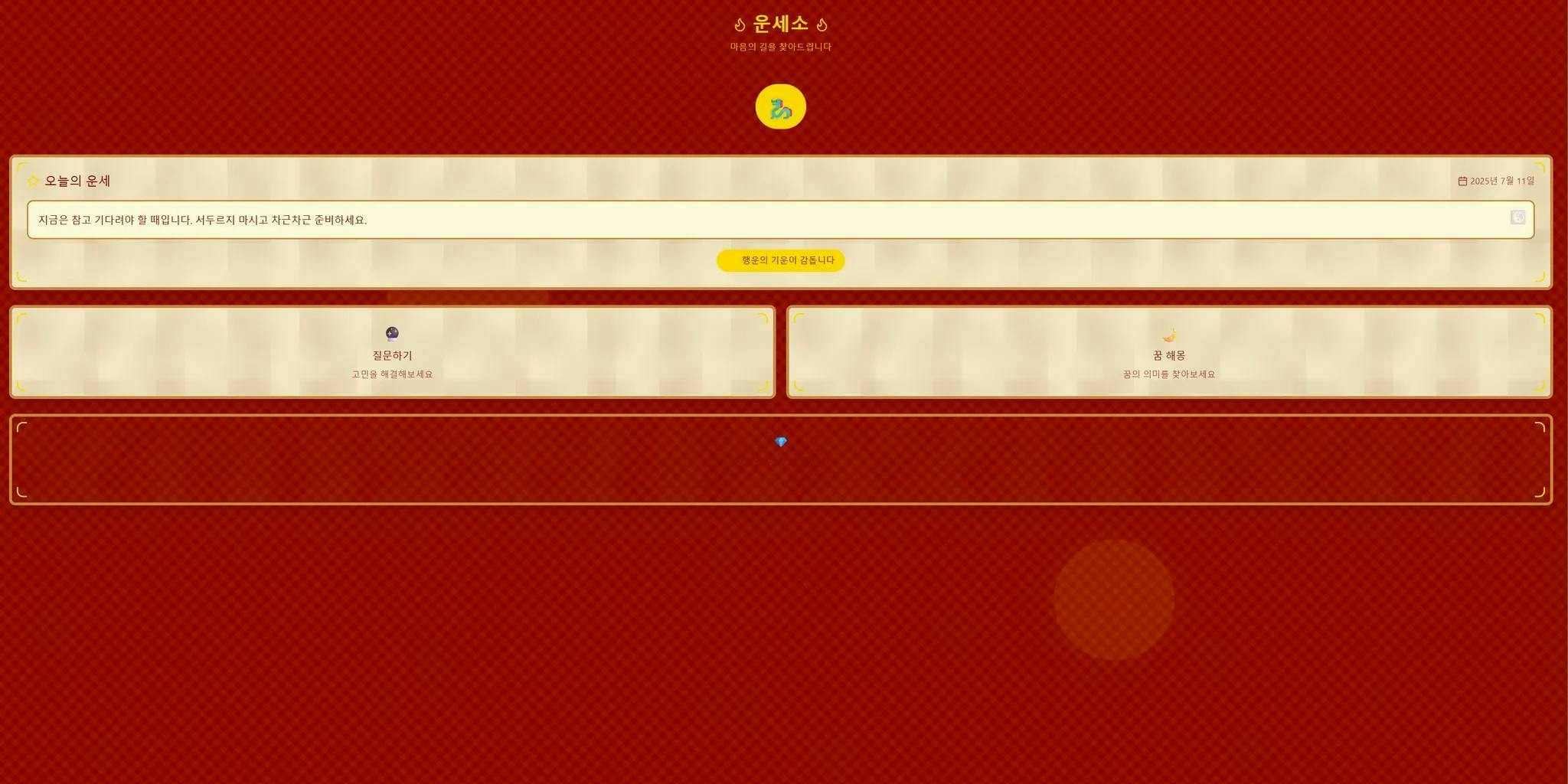
컨셉 이미지가 상당히 맘에 들었는데, 결과물은 다소 아쉬웠습니다.
스터디에서 진행했던 픽셀아트 + 자기소개서 프롬프트의 조합과 비교했을때, 입력 프롬프트의 양과 질이 많은 것을 좌우한다는 생각이 들었습니다.
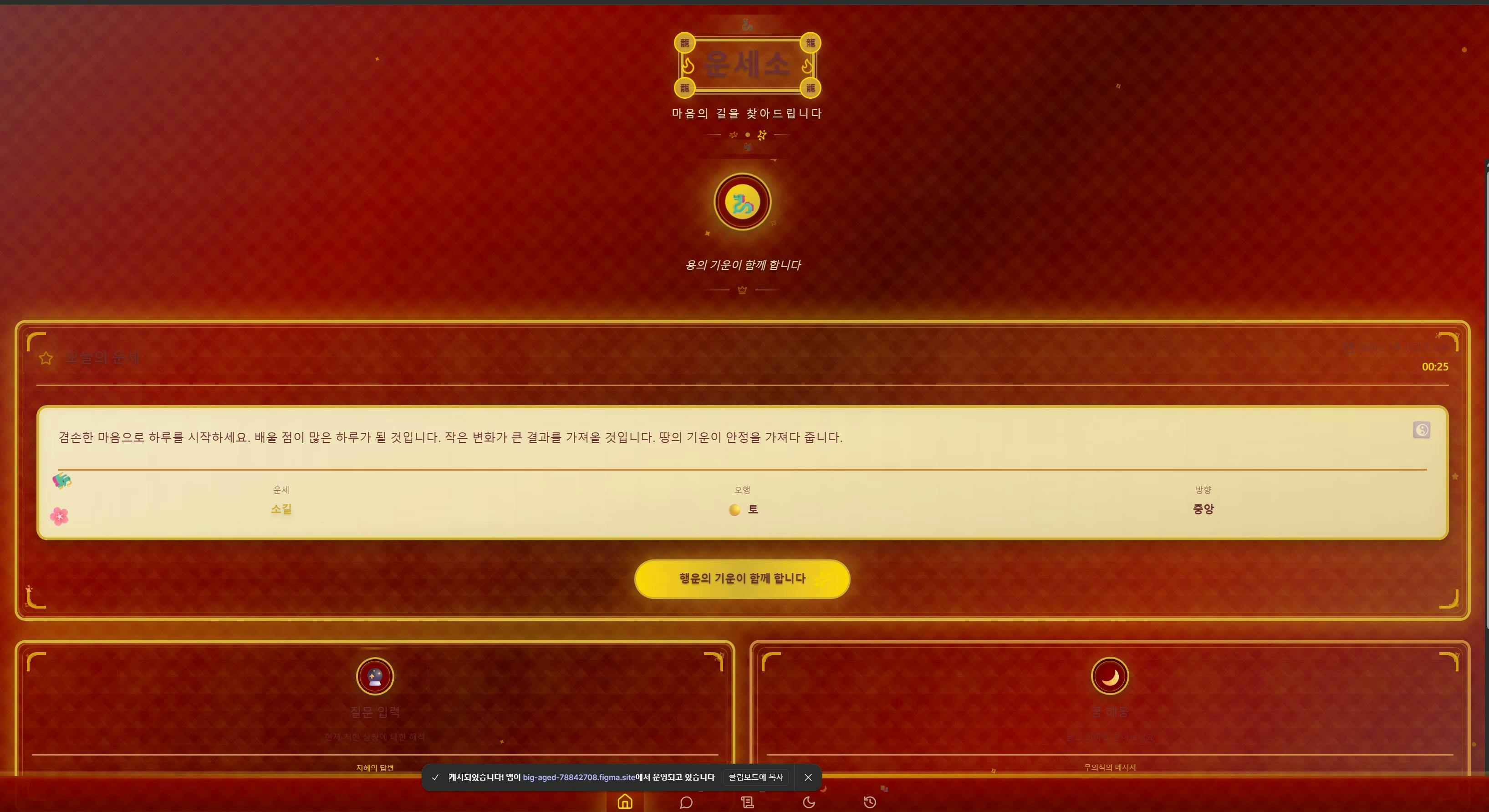
이미지 한번 더넣고 만든 버전
로그인하고 댓글을 남겨 주세요

개인적으로 흥미 많은 주제네요 ㅎㅎ
색감 같은 스타일은 잘 가져왔는데 묘하게 컨셉 이미지와 달라보이는게 왠지 제 추측으로는
폰트 사이즈 대비 차이 (더..더 드라마틱하게 차이나야 할 것 같아요..!)
색상 차이 (레드+골드 색상이지만 첨부 이미지와 정확히 일치하는 색상 코드가 아닌 것 같아요)
제공하신 이미지는 모바일버전에 더 적합해보이는데, figma make 가 웹버전으로 만들어져서
인 것 같습니다..!

필요한 AI 정보만
메일함에 쏙쏙 넣어드려요.
지금 핫한 AI 소식부터 직접 해 본 사례까지, 월요일마다 무료로 받아보세요
종현님! 우선 UX진단 GPTs를 넘 잘 활용해주셔서 보람 한가득 느끼면서 보았습니다 감사해요ㅎㅎ 아웃풋 이미지가 마음에 드셨는데 피그마에 적용할때 잘 반영이 안되었다면 2가지 이유가 있을걸로 예상되는데요, 1. 스터디때 실습했던 UI Builder용 GPTs 를 추가적으로 사용하지 않으셨거나 2. 피그마가 원하는 스타일의 적용 방향성을 인지 못했거나.
결론적으로, 해결방법은 현재의 요건을 유지하면서 마음에 드셨던 이미지를 다시 스타일에만 입혀보는 방법이 있는데, 이부분은 스터디때 공유해주시면 제가 피드백 좀 더 드리도록 하겠습니다. 넘 수고 많으셨습니다😊