중, 고등학교 학생들과 함께 진행할 카드 매칭 게임
2026.03.30
소개
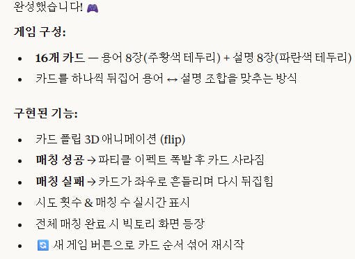
중고등학생과 함께 진행할 교육용 게임 프로토타입을 개발하는 것을 목표로 진행해 본 내용입니다.
진행 방법
어떤 도구를 사용했고, 어떻게 활용하셨나요?
처음엔 Gamini를 사용했는데 구현해 준 코드가 동작을 하지 않는 문제가 있었습니다.
그래서 다시 Claude에게 요청을 해서 진행을 했습니다.
Tip: 사용한 프롬프트 전문을 꼭 포함하고, 내용을 짧게 소개해 주세요.
"카드 16개를 매칭하는 게임을 만들거야. 카드에는 용어와 그 용어를 설명하는 두 개의 카드가 매칭되는 형태야. 카드에는 텍스트가 적혀 있는데 교육용이라 카드에 들어갈 문구는 이런 거야. 1. 커버리지 = 테스트가 된 정도를 나타내는 용어 2. 프로시저 = 테스트 순서 3. 결함(bug) = 프로그램의 의도하지 않은 동작 4. 테스트 케이스(TC) = 테스트를 위한 입력값과 예상 결과의 집합 5. 회귀 테스트 = 수정 후 기존 기능 재점검 6. 블랙박스 테스트 = 내부 구조를 보지 않는 테스트 7. 화이트박스 테스트 = 코드의 구조를 확인하는 테스트 8. 정적 분석 = 코드를 실행하지 않고 검사 카드를 열어서 문구를 확인하고 매칭되면 화면에서 사라지면서 이펙트가 나오는 형태의 게임이야. html 단일 파일에 코드를 작성하는 형태로 개발해 줬으면 해."
아무래도 Gamini로 구동이 안 되는 문제를 발견했기 때문에 좀 더 세부적으로 구현할 내용을 정리했습니다. 제가 잘 아는 분야로 만들어 보았습니다.
Tip: 활용 이미지나 캡처 화면을 꼭 남겨주세요.
Tip: 코드 전문은 코드블록에 감싸서 작성해주세요. ( / 을 눌러 '코드 블록'을 선택)
<!DOCTYPE html>
<html lang="ko">
<head>
<meta charset="UTF-8">
<meta name="viewport" content="width=device-width, initial-scale=1.0">
<title>테스트 용어 매칭 게임</title>
<style>
  :root {
    --bg: #0d0f1a;
    --surface: #141828;
    --card-back: #1e2540;
    --card-border: #2e3a6e;
    --accent: #4f8ef7;
    --accent2: #f7a14f;
    --match-color: #4fffa0;
    --text: #e8eaf6;
    --text-dim: #7986cb;
    --glow: rgba(79,142,247,0.35);
    --match-glow: rgba(79,255,160,0.4);
  }

  * { box-sizing: border-box; margin: 0; padding: 0; }

  body {
    background: var(--bg);
    font-family: 'Gowun Dodum', sans-serif;
    color: var(--text);
    min-height: 100vh;
    display: flex;
    flex-direction: column;
    align-items: center;
    padding: 24px 16px 48px;
    overflow-x: hidden;
  }

  /* Starfield background */
  body::before {
    content: '';
    position: fixed;
    inset: 0;
    background-image:
      radial-gradient(1px 1px at 10% 20%, rgba(255,255,255,0.4) 0%, transparent 100%),
      radial-gradient(1px 1px at 30% 60%, rgba(255,255,255,0.3) 0%, transparent 100%),
      radial-gradient(1px 1px at 50% 10%, rgba(255,255,255,0.5) 0%, transparent 100%),
      radial-gradient(1px 1px at 70% 80%, rgba(255,255,255,0.3) 0%, transparent 100%),
      radial-gradient(1px 1px at 90% 40%, rgba(255,255,255,0.4) 0%, transparent 100%),
      radial-gradient(1px 1px at 15% 85%, rgba(255,255,255,0.2) 0%, transparent 100%),
      radial-gradient(1px 1px at 55% 50%, rgba(255,255,255,0.35) 0%, transparent 100%),
      radial-gradient(1px 1px at 80% 15%, rgba(255,255,255,0.25) 0%, transparent 100%);
    pointer-events: none;
    z-index: 0;
  }

  header {
    position: relative;
    z-index: 1;
    text-align: center;
    margin-bottom: 28px;
  }

  header h1 {
    font-family: 'Black Han Sans', sans-serif;
    font-size: clamp(22px, 5vw, 36px);
    letter-spacing: 0.05em;
    background: linear-gradient(135deg, var(--accent) 0%, #a78bfa 50%, var(--accent2) 100%);
    -webkit-background-clip: text;
    -webkit-text-fill-color: transparent;
    background-clip: text;
    text-shadow: none;
    margin-bottom: 8px;
  }

  header p {
    color: var(--text-dim);
    font-size: 13px;
    letter-spacing: 0.04em;
  }

  .stats {
    position: relative;
    z-index: 1;
    display: flex;
    gap: 24px;
    margin-bottom: 28px;
    font-size: 14px;
    color: var(--text-dim);
  }

  .stats span {
    display: flex;
    align-items: center;
    gap: 6px;
  }

  .stats b {
    color: var(--accent);
    font-family: 'Black Han Sans', sans-serif;
    font-size: 18px;
  }

  .grid {
    position: relative;
    z-index: 1;
    display: grid;
    grid-template-columns: repeat(4, 1fr);
    gap: 14px;
    max-width: 900px;
    width: 100%;
  }

  .card-wrapper {
    perspective: 800px;
    height: 110px;
  }

  .card {
    width: 100%;
    height: 100%;
    position: relative;
    transform-style: preserve-3d;
    transition: transform 0.55s cubic-bezier(0.4, 0, 0.2, 1);
    cursor: pointer;
    border-radius: 14px;
  }

  .card.flipped {
    transform: rotateY(180deg);
  }

  .card.matched {
    pointer-events: none;
    animation: matchPop 0.5s cubic-bezier(0.34,1.56,0.64,1) forwards;
  }

  @keyframes matchPop {
    0%   { transform: rotateY(180deg) scale(1); }
    40%  { transform: rotateY(180deg) scale(1.12); }
    70%  { transform: rotateY(180deg) scale(0.95); }
    100% { transform: rotateY(180deg) scale(1); opacity: 0; }
  }

  .card-face {
    position: absolute;
    inset: 0;
    border-radius: 14px;
    backface-visibility: hidden;
    display: flex;
    align-items: center;
    justify-content: center;
    padding: 12px;
    text-align: center;
    border: 1.5px solid var(--card-border);
  }

  /* Back face */
  .card-back-face {
    background: var(--card-back);
    background-image: repeating-linear-gradient(
      45deg,
      transparent,
      transparent 10px,
      rgba(79,142,247,0.04) 10px,
      rgba(79,142,247,0.04) 20px
    );
  }

  .card-back-face .back-icon {
    font-size: 28px;
    opacity: 0.4;
    user-select: none;
  }

  /* Front face */
  .card-front-face {
    transform: rotateY(180deg);
    background: var(--surface);
    border-color: var(--accent);
    box-shadow: 0 0 16px var(--glow), inset 0 0 12px rgba(79,142,247,0.06);
  }

  .card-front-face.term {
    border-color: var(--accent2);
    box-shadow: 0 0 16px rgba(247,161,79,0.3), inset 0 0 12px rgba(247,161,79,0.05);
  }

  .card-front-face .card-text {
    font-size: clamp(11px, 1.6vw, 14px);
    line-height: 1.5;
    color: var(--text);
  }

  .card-front-face.term .card-text {
    font-family: 'Black Han Sans', sans-serif;
    font-size: clamp(12px, 1.8vw, 16px);
    color: var(--accent2);
    letter-spacing: 0.03em;
  }

  /* Matched state overlay */
  .card.matched .card-front-face {
    border-color: var(--match-color);
    box-shadow: 0 0 24px var(--match-glow);
  }

  /* Shake animation on mismatch */
  .card.shake {
    animation: shake 0.45s ease;
  }

  @keyframes shake {
    0%, 100% { transform: rotateY(180deg) translateX(0); }
    20%       { transform: rotateY(180deg) translateX(-7px); }
    40%       { transform: rotateY(180deg) translateX(7px); }
    60%       { transform: rotateY(180deg) translateX(-5px); }
    80%       { transform: rotateY(180deg) translateX(5px); }
  }

  /* Particle burst */
  .particle-container {
    position: fixed;
    pointer-events: none;
    z-index: 9999;
  }

  .particle {
    position: absolute;
    width: 8px;
    height: 8px;
    border-radius: 50%;
    animation: particleBurst 0.7s ease-out forwards;
  }

  @keyframes particleBurst {
    0%   { transform: translate(0,0) scale(1); opacity: 1; }
    100% { transform: translate(var(--tx), var(--ty)) scale(0); opacity: 0; }
  }

  /* Victory overlay */
  .victory {
    display: none;
    position: fixed;
    inset: 0;
    background: rgba(13,15,26,0.92);
    z-index: 1000;
    flex-direction: column;
    align-items: center;
    justify-content: center;
    gap: 20px;
    animation: fadeIn 0.5s ease;
  }

  .victory.show { display: flex; }

  @keyframes fadeIn { from { opacity: 0; } to { opacity: 1; } }

  .victory h2 {
    font-family: 'Black Han Sans', sans-serif;
    font-size: 48px;
    background: linear-gradient(135deg, var(--match-color), var(--accent), var(--accent2));
    -webkit-background-clip: text;
    -webkit-text-fill-color: transparent;
    background-clip: text;
    animation: pulse 1.2s ease-in-out infinite alternate;
  }

  @keyframes pulse {
    from { filter: brightness(1); }
    to   { filter: brightness(1.4); }
  }

  .victory p {
    color: var(--text-dim);
    font-size: 16px;
  }

  .victory .final-moves {
    font-size: 22px;
    color: var(--accent);
    font-family: 'Black Han Sans', sans-serif;
  }

  .btn-restart {
    margin-top: 8px;
    padding: 12px 36px;
    background: linear-gradient(135deg, var(--accent), #a78bfa);
    border: none;
    border-radius: 50px;
    color: #fff;
    font-family: 'Black Han Sans', sans-serif;
    font-size: 16px;
    letter-spacing: 0.06em;
    cursor: pointer;
    transition: transform 0.2s, box-shadow 0.2s;
    box-shadow: 0 4px 20px rgba(79,142,247,0.4);
  }

  .btn-restart:hover {
    transform: translateY(-2px) scale(1.04);
    box-shadow: 0 8px 28px rgba(79,142,247,0.55);
  }

  .btn-restart:active {
    transform: translateY(0) scale(0.98);
  }

  .restart-top {
    position: relative;
    z-index: 2;
    margin-top: 24px;
  }

  @media (max-width: 600px) {
    .grid {
      grid-template-columns: repeat(4, 1fr);
      gap: 8px;
    }
    .card-wrapper { height: 80px; }
    .card-front-face .card-text { font-size: 9px; }
    .card-front-face.term .card-text { font-size: 10px; }
  }
</style>
</head>
<body>

<header>
  <h1>🧪 테스트 용어 매칭</h1>
  <p>카드를 뒤집어 용어와 설명을 짝지어 보세요</p>
</header>

<div class="stats">
  <span>🎯 매칭 <b id="matchCount">0</b> / 8</span>
  <span>🔢 시도 <b id="moveCount">0</b></span>
</div>

<div class="grid" id="grid"></div>

<button class="btn-restart restart-top" onclick="initGame()">🔄 새 게임</button>

<div class="victory" id="victory">
  <h2>🎉 완료!</h2>
  <p class="final-moves" id="finalMoves"></p>
  <p>모든 카드를 매칭했습니다!</p>
  <button class="btn-restart" onclick="initGame(); document.getElementById('victory').classList.remove('show')">🔄 다시 하기</button>
</div>

<script>
const PAIRS = [
  { term: '커버리지',         desc: '테스트가 된 정도를\n나타내는 용어' },
  { term: '프로시저',         desc: '테스트 순서' },
  { term: '결함 (Bug)',       desc: '프로그램의 의도하지\n않은 동작' },
  { term: '테스트 케이스 (TC)', desc: '테스트를 위한 입력값과\n예상 결과의 집합' },
  { term: '회귀 테스트',      desc: '수정 후 기존 기능\n재점검' },
  { term: '블랙박스 테스트',  desc: '내부 구조를 보지\n않는 테스트' },
  { term: '화이트박스 테스트', desc: '코드의 구조를\n확인하는 테스트' },
  { term: '정적 분석',        desc: '코드를 실행하지\n않고 검사' },
];

const PARTICLE_COLORS = ['#4f8ef7','#4fffa0','#f7a14f','#a78bfa','#f76fd0','#fff'];

let flipped = [];
let matched = 0;
let moves = 0;
let locked = false;

function shuffle(arr) {
  return [...arr].sort(() => Math.random() - 0.5);
}

function initGame() {
  const grid = document.getElementById('grid');
  grid.innerHTML = '';
  flipped = [];
  matched = 0;
  moves = 0;
  locked = false;
  document.getElementById('matchCount').textContent = '0';
  document.getElementById('moveCount').textContent = '0';

  // Build card data: each pair gets an id
  let cards = [];
  PAIRS.forEach((pair, idx) => {
    cards.push({ id: idx, type: 'term', text: pair.term, pairId: idx });
    cards.push({ id: idx + 100, type: 'desc', text: pair.desc, pairId: idx });
  });
  cards = shuffle(cards);

  cards.forEach(card => {
    const wrapper = document.createElement('div');
    wrapper.className = 'card-wrapper';

    const el = document.createElement('div');
    el.className = 'card';
    el.dataset.pairId = card.pairId;
    el.dataset.cardId = card.id;
    el.dataset.type = card.type;

    el.innerHTML = `
      <div class="card-face card-back-face">
        <span class="back-icon">❓</span>
      </div>
      <div class="card-face card-front-face ${card.type === 'term' ? 'term' : ''}">
        <span class="card-text">${card.text.replace(/\n/g, '<br>')}</span>
      </div>
    `;

    el.addEventListener('click', () => onCardClick(el));
    wrapper.appendChild(el);
    grid.appendChild(wrapper);
  });
}

function onCardClick(card) {
  if (locked) return;
  if (card.classList.contains('flipped')) return;
  if (card.classList.contains('matched')) return;

  card.classList.add('flipped');
  flipped.push(card);

  if (flipped.length === 2) {
    moves++;
    document.getElementById('moveCount').textContent = moves;
    locked = true;
    checkMatch();
  }
}

function checkMatch() {
  const [a, b] = flipped;
  const sameType = a.dataset.type === b.dataset.type;
  const samePair = a.dataset.pairId === b.dataset.pairId;

  if (samePair && !sameType) {
    // Match!
    setTimeout(() => {
      const rectA = a.getBoundingClientRect();
      const rectB = b.getBoundingClientRect();
      spawnParticles(rectA.left + rectA.width / 2, rectA.top + rectA.height / 2);
      spawnParticles(rectB.left + rectB.width / 2, rectB.top + rectB.height / 2);

      a.classList.add('matched');
      b.classList.add('matched');

      matched++;
      document.getElementById('matchCount').textContent = matched;

      setTimeout(() => {
        a.parentElement.style.visibility = 'hidden';
        b.parentElement.style.visibility = 'hidden';
      }, 500);

      flipped = [];
      locked = false;

      if (matched === 8) {
        setTimeout(() => {
          document.getElementById('finalMoves').textContent = `총 ${moves}번 시도`;
          document.getElementById('victory').classList.add('show');
        }, 700);
      }
    }, 300);
  } else {
    // Mismatch
    setTimeout(() => {
      a.classList.add('shake');
      b.classList.add('shake');
      setTimeout(() => {
        a.classList.remove('flipped', 'shake');
        b.classList.remove('flipped', 'shake');
        flipped = [];
        locked = false;
      }, 450);
    }, 600);
  }
}

function spawnParticles(x, y) {
  const container = document.createElement('div');
  container.className = 'particle-container';
  container.style.left = x + 'px';
  container.style.top = y + 'px';
  document.body.appendChild(container);

  const count = 14;
  for (let i = 0; i < count; i++) {
    const p = document.createElement('div');
    p.className = 'particle';
    const angle = (360 / count) * i;
    const dist = 40 + Math.random() * 50;
    const tx = Math.cos(angle * Math.PI / 180) * dist;
    const ty = Math.sin(angle * Math.PI / 180) * dist;
    p.style.setProperty('--tx', tx + 'px');
    p.style.setProperty('--ty', ty + 'px');
    p.style.background = PARTICLE_COLORS[Math.floor(Math.random() * PARTICLE_COLORS.length)];
    p.style.left = '-4px';
    p.style.top = '-4px';
    container.appendChild(p);
  }

  setTimeout(() => container.remove(), 800);
}

initGame();
</script>
</body>
</html>
결과와 배운 점
프롬프트를 좀 더 구체적으로 제시하는 노력을 했고, 필요한 것들을 명확하게 이야기해야 구현이 되겠구나 싶은 깨달음을 얻었습니다.
HTML을 완전히 학습하는 것은 좀 어려움이 있겠지만 샘플을 통해서 데이터를 수정해 보고, 일부 수정을 하면서 배워보는 수업을 진행할 수 있겠다는 구체화가 좀 이루어지고 있습니다.
학생들에게 조금 더 재미있는 콘텐츠를 만들어볼 수 있겠다는 기대가 생겼습니다.

필요한 AI 정보만
메일함에 쏙쏙 넣어드려요.
지금 핫한 AI 소식부터 직접 해 본 사례까지, 월요일마다 무료로 받아보세요