


소개
지난 주부터 21기 스터디 참여해서 강의 교안은 앞으로 PPT로 만드는거 아니라고 교수님 설명하셔서 학생들이 어려워하는 부분을 웹으로 제작하는 것이 목표입니다.
진행 방법
어떤 도구를 사용했고, 어떻게 활용하셨나요?
Claude 사용했습니다.
Tip: 사용한 프롬프트 전문을 꼭 포함하고, 내용을 짧게 소개해 주세요.
제목: CSS3의 박스 모델 -HTML 태그는 사각형 박스로 다루어진다 각 HTML 태그 요소를 하나의 박스로 다움 박스 크기, 배경 색, 여백, 옆 박스와의 거리 등 제어 가능 -div는 대표적인 블록 태그 -span은 대표적인 인라인 태그 하단에 차이점 설명 -> 요런 형태의 웹 페이지를 구현해줘. HTML, CSS, JS를 하나의 HTML로 만들어 주면 좋겠어.
단일 파일에 만드는 것이 업로드가 편하니까요.
Tip: 활용 이미지나 캡처 화면을 꼭 남겨주세요.
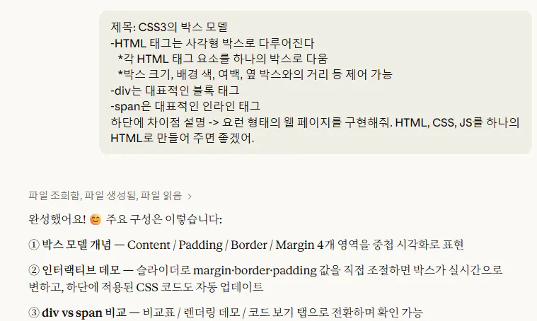
한국어로 된 문자 메시지의 스크린샷
Tip: 코드 전문은 코드블록에 감싸서 작성해주세요. ( / 을 눌러 '코드 블록'을 선택)
<!DOCTYPE html>
<html lang="ko">
<head>
<meta charset="UTF-8" />
<meta name="viewport" content="width=device-width, initial-scale=1.0"/>
<title>CSS3 박스 모델</title>
<link href="https://fonts.googleapis.com/css2?family=Noto+Sans+KR:wght@300;400;600;700;900&family=Space+Mono:wght@400;700&display=swap" rel="stylesheet"/>
<style>
:root {
--bg: #0d0d0d;
--surface: #161616;
--surface2: #1e1e1e;
--border: #2a2a2a;
--accent: #f0c040;
--accent2: #4fc3f7;
--accent3: #ef5350;
--text: #e8e8e8;
--text-muted: #888;
--block-color: #4fc3f7;
--inline-color: #f06292;
--margin-color: rgba(240,192,64,0.18);
--border-color: rgba(79,195,247,0.5);
--padding-color: rgba(240,96,146,0.18);
--content-color: rgba(79,195,247,0.22);
}
* { box-sizing: border-box; margin: 0; padding: 0; }
body {
background: var(--bg);
color: var(--text);
font-family: 'Noto Sans KR', sans-serif;
min-height: 100vh;
overflow-x: hidden;
}
/* 배경 격자 */
body::before {
content: '';
position: fixed;
inset: 0;
background-image:
linear-gradient(rgba(255,255,255,0.025) 1px, transparent 1px),
linear-gradient(90deg, rgba(255,255,255,0.025) 1px, transparent 1px);
background-size: 40px 40px;
pointer-events: none;
z-index: 0;
}
.wrapper {
position: relative;
z-index: 1;
max-width: 860px;
margin: 0 auto;
padding: 60px 24px 80px;
}
/* 헤더 */
.header {
margin-bottom: 56px;
animation: fadeDown 0.7s ease both;
}
.header-label {
font-family: 'Space Mono', monospace;
font-size: 11px;
letter-spacing: 0.2em;
color: var(--accent);
text-transform: uppercase;
margin-bottom: 12px;
}
h1 {
font-size: clamp(2rem, 5vw, 3.2rem);
font-weight: 900;
line-height: 1.1;
letter-spacing: -0.02em;
}
h1 span {
color: var(--accent);
}
.header-sub {
margin-top: 16px;
color: var(--text-muted);
font-size: 15px;
line-height: 1.7;
max-width: 540px;
}
/* 섹션 */
.section {
background: var(--surface);
border: 1px solid var(--border);
border-radius: 12px;
padding: 32px;
margin-bottom: 24px;
animation: fadeUp 0.6s ease both;
}
.section:nth-child(2) { animation-delay: 0.1s; }
.section:nth-child(3) { animation-delay: 0.2s; }
.section:nth-child(4) { animation-delay: 0.3s; }
.section:nth-child(5) { animation-delay: 0.4s; }
.section-title {
font-family: 'Space Mono', monospace;
font-size: 11px;
letter-spacing: 0.15em;
text-transform: uppercase;
color: var(--accent);
margin-bottom: 20px;
display: flex;
align-items: center;
gap: 10px;
}
.section-title::after {
content: '';
flex: 1;
height: 1px;
background: var(--border);
}
.section h2 {
font-size: 1.25rem;
font-weight: 700;
margin-bottom: 12px;
color: var(--text);
}
.section p {
color: #aaa;
font-size: 14px;
line-height: 1.8;
}
/* 불릿 리스트 */
.bullet-list {
list-style: none;
margin-top: 14px;
display: flex;
flex-direction: column;
gap: 10px;
}
.bullet-list li {
font-size: 14px;
color: #bbb;
padding-left: 20px;
position: relative;
line-height: 1.7;
}
.bullet-list li::before {
content: '▸';
position: absolute;
left: 0;
color: var(--accent);
font-size: 12px;
}
/* 박스 모델 시각화 */
.box-visual {
position: relative;
margin: 24px auto;
width: fit-content;
}
.box-layer {
display: flex;
align-items: center;
justify-content: center;
border-radius: 6px;
position: relative;
cursor: default;
transition: filter 0.2s;
}
.box-layer:hover { filter: brightness(1.15); }
.layer-margin {
background: var(--margin-color);
border: 2px dashed var(--accent);
padding: 28px;
}
.layer-border {
background: var(--border-color);
border: 4px solid var(--accent2);
padding: 24px;
}
.layer-padding {
background: var(--padding-color);
border: 2px dashed var(--inline-color);
padding: 24px;
}
.layer-content {
background: var(--content-color);
border: 2px solid var(--accent2);
padding: 20px 36px;
font-family: 'Space Mono', monospace;
font-size: 14px;
color: var(--accent2);
font-weight: 700;
white-space: nowrap;
}
.layer-label {
position: absolute;
top: 6px;
left: 10px;
font-family: 'Space Mono', monospace;
font-size: 10px;
letter-spacing: 0.1em;
font-weight: 700;
opacity: 0.85;
}
.label-margin { color: var(--accent); }
.label-border { color: var(--accent2); }
.label-padding { color: var(--inline-color); }
/* 인터랙티브 박스 모델 */
.controls {
display: grid;
grid-template-columns: repeat(auto-fit, minmax(180px, 1fr));
gap: 16px;
margin-top: 20px;
}
.control-group label {
display: block;
font-size: 12px;
font-family: 'Space Mono', monospace;
color: var(--text-muted);
margin-bottom: 6px;
letter-spacing: 0.08em;
}
.control-group input[type=range] {
width: 100%;
accent-color: var(--accent);
cursor: pointer;
}
.control-group .val {
font-size: 12px;
color: var(--accent);
font-family: 'Space Mono', monospace;
text-align: right;
}
#live-box-wrap {
display: flex;
justify-content: center;
align-items: center;
min-height: 220px;
margin-top: 24px;
background: var(--surface2);
border: 1px solid var(--border);
border-radius: 8px;
padding: 20px;
overflow: auto;
}
#live-margin {
background: rgba(240,192,64,0.12);
border: 2px dashed var(--accent);
display: inline-flex;
align-items: center;
justify-content: center;
transition: all 0.3s ease;
}
#live-border {
background: rgba(79,195,247,0.12);
display: inline-flex;
align-items: center;
justify-content: center;
transition: all 0.3s ease;
}
#live-padding {
background: rgba(240,96,146,0.12);
border: 2px dashed var(--inline-color);
display: inline-flex;
align-items: center;
justify-content: center;
transition: all 0.3s ease;
}
#live-content {
background: rgba(79,195,247,0.2);
border: 2px solid var(--accent2);
padding: 10px 20px;
font-family: 'Space Mono', monospace;
font-size: 13px;
color: var(--accent2);
font-weight: 700;
white-space: nowrap;
transition: all 0.3s ease;
}
/* div vs span */
.compare-grid {
display: grid;
grid-template-columns: 1fr 1fr;
gap: 20px;
margin-top: 20px;
}
@media (max-width: 560px) {
.compare-grid { grid-template-columns: 1fr; }
}
.compare-card {
background: var(--surface2);
border: 1px solid var(--border);
border-radius: 10px;
padding: 24px;
transition: transform 0.2s, border-color 0.2s;
}
.compare-card:hover {
transform: translateY(-3px);
}
.compare-card.block-card { border-top: 3px solid var(--block-color); }
.compare-card.inline-card { border-top: 3px solid var(--inline-color); }
.compare-card .tag {
font-family: 'Space Mono', monospace;
font-size: 22px;
font-weight: 700;
margin-bottom: 8px;
}
.block-card .tag { color: var(--block-color); }
.inline-card .tag { color: var(--inline-color); }
.compare-card .type-badge {
display: inline-block;
font-size: 10px;
font-family: 'Space Mono', monospace;
letter-spacing: 0.1em;
padding: 3px 10px;
border-radius: 20px;
margin-bottom: 16px;
font-weight: 700;
}
.block-card .type-badge {
background: rgba(79,195,247,0.15);
color: var(--block-color);
border: 1px solid rgba(79,195,247,0.3);
}
.inline-card .type-badge {
background: rgba(240,96,146,0.15);
color: var(--inline-color);
border: 1px solid rgba(240,96,146,0.3);
}
.compare-list {
list-style: none;
display: flex;
flex-direction: column;
gap: 8px;
}
.compare-list li {
font-size: 13px;
color: #aaa;
padding-left: 16px;
position: relative;
line-height: 1.6;
}
.compare-list li::before {
content: '·';
position: absolute;
left: 4px;
font-size: 18px;
line-height: 1.2;
}
.block-card .compare-list li::before { color: var(--block-color); }
.inline-card .compare-list li::before { color: var(--inline-color); }
/* 데모 영역 */
.demo-area {
background: var(--surface2);
border: 1px solid var(--border);
border-radius: 8px;
padding: 20px;
margin-top: 20px;
line-height: 1.9;
font-size: 14px;
color: #ccc;
}
.demo-div {
background: rgba(79,195,247,0.12);
border: 1.5px solid rgba(79,195,247,0.4);
border-radius: 4px;
padding: 8px 14px;
margin: 6px 0;
color: var(--block-color);
font-family: 'Space Mono', monospace;
font-size: 13px;
}
.demo-span {
background: rgba(240,96,146,0.15);
border: 1.5px solid rgba(240,96,146,0.4);
border-radius: 3px;
padding: 2px 8px;
color: var(--inline-color);
font-family: 'Space Mono', monospace;
font-size: 13px;
}
/* 코드 블록 */
.code-block {
background: #111;
border: 1px solid var(--border);
border-radius: 8px;
padding: 18px 20px;
margin-top: 16px;
font-family: 'Space Mono', monospace;
font-size: 12.5px;
line-height: 1.8;
overflow-x: auto;
color: #ccc;
}
.code-block .kw { color: var(--accent2); }
.code-block .val { color: var(--accent); }
.code-block .cm { color: #555; }
/* 애니메이션 */
@keyframes fadeDown {
from { opacity: 0; transform: translateY(-20px); }
to { opacity: 1; transform: translateY(0); }
}
@keyframes fadeUp {
from { opacity: 0; transform: translateY(24px); }
to { opacity: 1; transform: translateY(0); }
}
/* 탭 */
.tabs {
display: flex;
gap: 8px;
margin-bottom: 20px;
flex-wrap: wrap;
}
.tab-btn {
background: var(--surface2);
border: 1px solid var(--border);
color: var(--text-muted);
padding: 7px 18px;
border-radius: 6px;
font-family: 'Space Mono', monospace;
font-size: 12px;
cursor: pointer;
transition: all 0.2s;
letter-spacing: 0.06em;
}
.tab-btn:hover { border-color: var(--accent); color: var(--accent); }
.tab-btn.active {
background: var(--accent);
border-color: var(--accent);
color: #000;
font-weight: 700;
}
.tab-panel { display: none; }
.tab-panel.active { display: block; }
/* 요약 카드 */
.summary-row {
display: grid;
grid-template-columns: repeat(auto-fit, minmax(160px, 1fr));
gap: 14px;
margin-top: 16px;
}
.summary-card {
background: var(--surface2);
border: 1px solid var(--border);
border-radius: 8px;
padding: 18px;
text-align: center;
}
.summary-card .s-icon {
font-size: 24px;
margin-bottom: 8px;
}
.summary-card .s-title {
font-family: 'Space Mono', monospace;
font-size: 12px;
font-weight: 700;
color: var(--accent);
margin-bottom: 6px;
}
.summary-card .s-desc {
font-size: 12px;
color: var(--text-muted);
line-height: 1.6;
}
</style>
</head>
<body>
<div class="wrapper">
<!-- 헤더 -->
<div class="header">
<div class="header-label">CSS3 / Layout Fundamentals</div>
<h1>박스 <span>모델</span><br/>Box Model</h1>
<p class="header-sub">HTML의 모든 태그 요소는 하나의 사각형 박스로 다루어집니다. 박스 모델은 크기, 여백, 테두리를 제어하는 CSS의 핵심 개념입니다.</p>
</div>
<!-- 박스 모델 개요 -->
<div class="section">
<div class="section-title">01 · Box Model 개념</div>
<h2>HTML 태그는 사각형 박스로 다루어진다</h2>
<ul class="bullet-list">
<li>각 HTML 태그 요소를 하나의 박스(Box)로 취급합니다.</li>
<li>박스 크기, 배경 색, 여백, 옆 박스와의 거리 등을 제어할 수 있습니다.</li>
<li>모든 박스는 <b>Content → Padding → Border → Margin</b> 4개 영역으로 구성됩니다.</li>
</ul>
<!-- 박스 모델 시각화 -->
<div class="box-visual" style="margin: 32px auto;">
<div class="box-layer layer-margin">
<span class="layer-label label-margin">MARGIN</span>
<div class="box-layer layer-border">
<span class="layer-label label-border">BORDER</span>
<div class="box-layer layer-padding">
<span class="layer-label" style="color:var(--inline-color)">PADDING</span>
<div class="layer-content">CONTENT</div>
</div>
</div>
</div>
</div>
<div class="summary-row">
<div class="summary-card">
<div class="s-icon">📦</div>
<div class="s-title">Content</div>
<div class="s-desc">실제 내용이 담기는 영역. width / height로 크기 설정</div>
</div>
<div class="summary-card">
<div class="s-icon">🔲</div>
<div class="s-title">Padding</div>
<div class="s-desc">Content와 Border 사이의 내부 여백</div>
</div>
<div class="summary-card">
<div class="s-icon">🖼️</div>
<div class="s-title">Border</div>
<div class="s-desc">박스의 테두리. 굵기·스타일·색상 지정 가능</div>
</div>
<div class="summary-card">
<div class="s-icon">↔️</div>
<div class="s-title">Margin</div>
<div class="s-desc">박스 바깥쪽 여백. 다른 요소와의 간격</div>
</div>
</div>
</div>
<!-- 인터랙티브 박스 모델 -->
<div class="section">
<div class="section-title">02 · Interactive Demo</div>
<h2>직접 조절해보는 박스 모델</h2>
<p>슬라이더를 움직여 각 영역의 크기 변화를 실시간으로 확인하세요.</p>
<div class="controls">
<div class="control-group">
<label>MARGIN</label>
<input type="range" id="ctrl-margin" min="0" max="40" value="20"/>
<div class="val" id="val-margin">20px</div>
</div>
<div class="control-group">
<label>BORDER</label>
<input type="range" id="ctrl-border" min="0" max="20" value="4"/>
<div class="val" id="val-border">4px</div>
</div>
<div class="control-group">
<label>PADDING</label>
<input type="range" id="ctrl-padding" min="0" max="40" value="16"/>
<div class="val" id="val-padding">16px</div>
</div>
</div>
<div id="live-box-wrap">
<div id="live-margin">
<div id="live-border">
<div id="live-padding">
<div id="live-content">CONTENT</div>
</div>
</div>
</div>
</div>
<div class="code-block" id="live-code">
<span class="cm">/* 현재 적용된 CSS */</span><br/>
<span class="kw">div</span> {<br/>
<span class="kw">margin</span>: <span class="val" id="code-margin">20px</span>;<br/>
<span class="kw">border</span>: <span class="val" id="code-border">4px</span> solid #4fc3f7;<br/>
<span class="kw">padding</span>: <span class="val" id="code-padding">16px</span>;<br/>
}
</div>
</div>
<!-- div vs span -->
<div class="section">
<div class="section-title">03 · Block vs Inline</div>
<h2>div와 span의 차이점</h2>
<div class="tabs">
<button class="tab-btn active" onclick="switchTab(this,'tab-compare')">비교표</button>
<button class="tab-btn" onclick="switchTab(this,'tab-demo')">렌더링 데모</button>
<button class="tab-btn" onclick="switchTab(this,'tab-code')">코드 보기</button>
</div>
<div id="tab-compare" class="tab-panel active">
<div class="compare-grid">
<div class="compare-card block-card">
<div class="tag"><div></div>
<span class="type-badge">BLOCK TAG</span>
<ul class="compare-list">
<li>대표적인 <b>블록(Block)</b> 태그</li>
<li>항상 새 줄에서 시작</li>
<li>가로 폭이 부모 너비 100%를 차지</li>
<li>width, height 설정 가능</li>
<li>margin, padding 사방 모두 적용</li>
<li>레이아웃 구조 설계에 사용</li>
</ul>
</div>
<div class="compare-card inline-card">
<div class="tag"><span></div>
<span class="type-badge">INLINE TAG</span>
<ul class="compare-list">
<li>대표적인 <b>인라인(Inline)</b> 태그</li>
<li>줄 바꿈 없이 옆으로 나열</li>
<li>콘텐츠 크기만큼만 영역 차지</li>
<li>width, height 설정 불가</li>
<li>상하 margin/padding 제한적 적용</li>
<li>텍스트 일부 스타일 지정에 사용</li>
</ul>
</div>
</div>
</div>
<div id="tab-demo" class="tab-panel">
<p style="font-size:13px;color:var(--text-muted);margin-bottom:14px;">아래는 실제 브라우저에서 div와 span이 렌더링되는 모습입니다.</p>
<div class="demo-area">
텍스트 시작 —
<div class="demo-div"><div> 블록 요소: 새 줄에서 시작, 전체 너비 차지</div>
<div class="demo-div"><div> 두 번째 div: 또 새 줄에서 시작</div>
텍스트 재개 —
<span class="demo-span"><span> 인라인</span>
은 줄 바꿈 없이
<span class="demo-span"><span> 이어서</span>
나란히 이어집니다.
</div>
</div>
<div id="tab-code" class="tab-panel">
<div class="code-block">
<span class="cm"><!-- 블록 태그: div --></span><br/>
<span class="kw"><div</span> style="<span class="val">background: #1a3a4a; padding: 10px;</span>"<span class="kw">></span><br/>
div는 블록 요소입니다.<br/>
<span class="kw"></div></span><br/><br/>
<span class="cm"><!-- 인라인 태그: span --></span><br/>
<span class="kw"><p></span>텍스트 안에서<br/>
<span class="kw"><span</span> style="<span class="val">color: #f06292;</span>"<span class="kw">></span>span 인라인<span class="kw"></span></span><br/>
요소가 사용됩니다.<br/>
<span class="kw"></p></span>
</div>
</div>
</div>
</div>
<script>
// 인터랙티브 박스 모델 슬라이더
const margin = document.getElementById('ctrl-margin');
const border = document.getElementById('ctrl-border');
const padding = document.getElementById('ctrl-padding');
function updateLiveBox() {
const m = margin.value, b = border.value, p = padding.value;
document.getElementById('val-margin').textContent = m + 'px';
document.getElementById('val-border').textContent = b + 'px';
document.getElementById('val-padding').textContent = p + 'px';
const lm = document.getElementById('live-margin');
const lb = document.getElementById('live-border');
const lp = document.getElementById('live-padding');
lm.style.padding = m + 'px';
lb.style.border = b + 'px solid #4fc3f7';
lb.style.padding = '0';
lp.style.padding = p + 'px';
document.getElementById('code-margin').textContent = m + 'px';
document.getElementById('code-border').textContent = b + 'px';
document.getElementById('code-padding').textContent = p + 'px';
}
margin.addEventListener('input', updateLiveBox);
border.addEventListener('input', updateLiveBox);
padding.addEventListener('input', updateLiveBox);
updateLiveBox();
// 탭 전환
function switchTab(btn, panelId) {
document.querySelectorAll('.tab-btn').forEach(b => b.classList.remove('active'));
document.querySelectorAll('.tab-panel').forEach(p => p.classList.remove('active'));
btn.classList.add('active');
document.getElementById(panelId).classList.add('active');
}
</script>
</body>
</html>
결과와 배운 점
배운 점과 나만의 꿀팁을 알려주세요.
생성형 AI가 너무 잘 해줘서... 꿀팁이랄 것도 없었습니다.
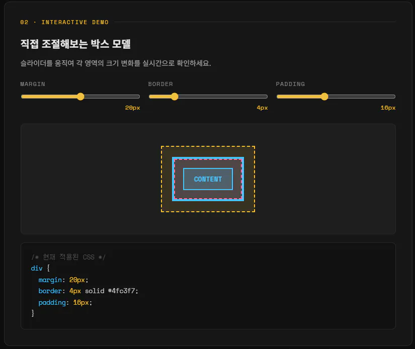
한국어가 포함된 한국어 웹사이트 스크린샷
다른 것보다 상단 바를 이용해서 하단에 이미지로 박스 모델을 설명해주는 부분이 굉장히 잘 만들어 졌다고 판단됩니다.
다음에 비교를 할 때는 시뮬레이션을 할 수 있게 해달라고 하면 좋겠다는 생각이 들었습니다.
