


소개
21기 교육앱만들기 엘리 교수님이 여러 웹 페이지를 하나로 묶은 페이지가 있으면 좋다고 하셔서 만들어 보았습니다.
진행 방법
어떤 도구를 사용했고, 어떻게 활용하셨나요?
claude code 사용했고, 한 폴더에 몰아 넣은 후에 순서대로 보이도록 만들어 달라고 했습니다.
Tip: 사용한 프롬프트 전문을 꼭 포함하고, 내용을 짧게 소개해 주세요.
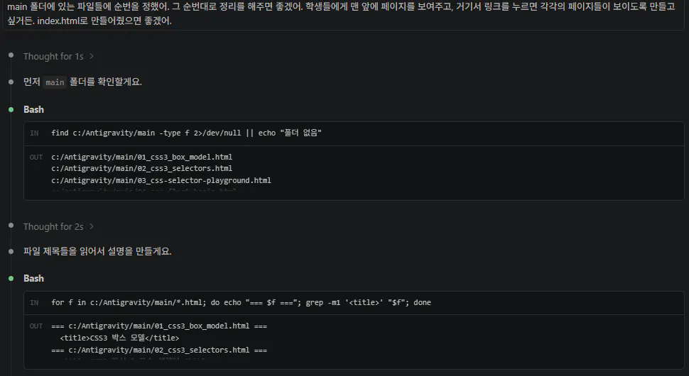
한국어 텍스트가 포함된 검은 화면의 스크린샷
Tip: 활용 이미지나 캡처 화면을 꼭 남겨주세요.
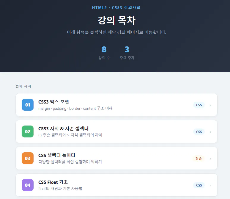
한국 CD 플레이어의 스크린샷
Tip: 코드 전문은 코드블록에 감싸서 작성해주세요. ( / 을 눌러 '코드 블록'을 선택)
<!DOCTYPE html>
<html lang="ko">
<head>
<meta charset="UTF-8">
<meta name="viewport" content="width=device-width, initial-scale=1.0">
<title>HTML5 강의 목차</title>
<style>
* { margin: 0; padding: 0; box-sizing: border-box; }
body {
font-family: 'Segoe UI', 'Malgun Gothic', sans-serif;
background: #f0f4f8;
min-height: 100vh;
}
/* ── 헤더 ── */
header {
background: linear-gradient(135deg, #1a202c 0%, #2d3748 100%);
color: white;
text-align: center;
padding: 52px 24px 40px;
}
header .subtitle {
font-size: 12px;
font-weight: 700;
letter-spacing: 2px;
color: #63b3ed;
text-transform: uppercase;
margin-bottom: 14px;
}
header h1 {
font-size: 30px;
font-weight: 800;
margin-bottom: 10px;
}
header p {
color: #a0aec0;
font-size: 14px;
}
/* ── 카운터 배지 ── */
.stats {
display: flex;
justify-content: center;
gap: 32px;
margin-top: 28px;
}
.stat { text-align: center; }
.stat .num { font-size: 28px; font-weight: 800; color: #63b3ed; }
.stat .label { font-size: 12px; color: #718096; margin-top: 2px; }
/* ── 목차 리스트 ── */
main {
max-width: 720px;
margin: 40px auto 60px;
padding: 0 20px;
}
.chapter-label {
font-size: 11px;
font-weight: 700;
letter-spacing: 1.5px;
color: #718096;
text-transform: uppercase;
margin-bottom: 16px;
}
.list {
display: flex;
flex-direction: column;
gap: 12px;
}
.item {
display: flex;
align-items: center;
gap: 16px;
background: white;
border-radius: 12px;
padding: 18px 20px;
text-decoration: none;
color: inherit;
border: 1px solid #e2e8f0;
box-shadow: 0 2px 6px rgba(0,0,0,0.04);
transition: transform 0.15s, box-shadow 0.15s, border-color 0.15s;
}
.item:hover {
transform: translateY(-2px);
box-shadow: 0 6px 18px rgba(0,0,0,0.1);
border-color: #90cdf4;
}
/* 순번 뱃지 */
.num-badge {
flex-shrink: 0;
width: 40px; height: 40px;
border-radius: 10px;
display: flex; align-items: center; justify-content: center;
font-size: 15px; font-weight: 800;
color: white;
}
.c1 { background: #4299e1; }
.c2 { background: #48bb78; }
.c3 { background: #ed8936; }
.c4 { background: #9f7aea; }
.c5 { background: #f56565; }
.c6 { background: #38b2ac; }
.c7 { background: #667eea; }
.c8 { background: #ed64a6; }
.item-body { flex: 1; }
.item-body .title {
font-size: 15px;
font-weight: 700;
color: #1a202c;
margin-bottom: 3px;
}
.item-body .desc {
font-size: 12.5px;
color: #718096;
}
/* 태그 */
.tag {
flex-shrink: 0;
font-size: 11px;
font-weight: 700;
padding: 3px 10px;
border-radius: 20px;
background: #ebf8ff;
color: #2b6cb0;
}
.tag.review { background: #faf5ff; color: #553c9a; }
.tag.compare { background: #f0fff4; color: #276749; }
.tag.practice{ background: #fffaf0; color: #c05621; }
/* 화살표 */
.arrow {
flex-shrink: 0;
color: #cbd5e0;
font-size: 18px;
}
.item:hover .arrow { color: #4299e1; }
footer {
text-align: center;
padding: 24px;
font-size: 12px;
color: #a0aec0;
}
</style>
</head>
<body>
<header>
<div class="subtitle">HTML5 · CSS3 강의자료</div>
<h1>강의 목차</h1>
<p>아래 항목을 클릭하면 해당 강의 페이지로 이동합니다.</p>
<div class="stats">
<div class="stat">
<div class="num">8</div>
<div class="label">강의 수</div>
</div>
<div class="stat">
<div class="num">3</div>
<div class="label">주요 주제</div>
</div>
</div>
</header>
<main>
<p class="chapter-label">전체 목차</p>
<div class="list">
<a class="item" href="01_css3_box_model.html" target="_blank">
<div class="num-badge c1">01</div>
<div class="item-body">
<div class="title">CSS3 박스 모델</div>
<div class="desc">margin · padding · border · content 구조 이해</div>
</div>
<span class="tag">CSS</span>
<span class="arrow">›</span>
</a>
<a class="item" href="02_css3_selectors.html" target="_blank">
<div class="num-badge c2">02</div>
<div class="item-body">
<div class="title">CSS3 자식 & 자손 셀렉터</div>
<div class="desc">( ) 후손 셀렉터와 > 자식 셀렉터의 차이</div>
</div>
<span class="tag">CSS</span>
<span class="arrow">›</span>
</a>
<a class="item" href="03_css-selector-playground.html" target="_blank">
<div class="num-badge c3">03</div>
<div class="item-body">
<div class="title">CSS 셀렉터 놀이터</div>
<div class="desc">다양한 셀렉터를 직접 실험하며 익히기</div>
</div>
<span class="tag practice">실습</span>
<span class="arrow">›</span>
</a>
<a class="item" href="04_css_float_basic.html" target="_blank">
<div class="num-badge c4">04</div>
<div class="item-body">
<div class="title">CSS Float 기초</div>
<div class="desc">float의 개념과 기본 사용법</div>
</div>
<span class="tag">CSS</span>
<span class="arrow">›</span>
</a>
<a class="item" href="05_css_float.html" target="_blank">
<div class="num-badge c5">05</div>
<div class="item-body">
<div class="title">CSS Float 완전 정복</div>
<div class="desc">clearfix · 다단 레이아웃 · 실전 활용</div>
</div>
<span class="tag">CSS</span>
<span class="arrow">›</span>
</a>
<a class="item" href="06_css_position.html" target="_blank">
<div class="num-badge c6">06</div>
<div class="item-body">
<div class="title">CSS Position 완전 정복</div>
<div class="desc">static · relative · absolute · fixed · sticky</div>
</div>
<span class="tag">CSS</span>
<span class="arrow">›</span>
</a>
<a class="item" href="07_news_review.html" target="_blank">
<div class="num-badge c7">07</div>
<div class="item-body">
<div class="title">news.html 코드 리뷰</div>
<div class="desc">실제 뉴스 레이아웃 코드를 분석하는 코드 리뷰</div>
</div>
<span class="tag review">리뷰</span>
<span class="arrow">›</span>
</a>
<a class="item" href="08_float_vs_flex.html" target="_blank">
<div class="num-badge c8">08</div>
<div class="item-body">
<div class="title">float vs flexbox 비교</div>
<div class="desc">기존 float 코드를 flexbox로 개선하는 과정 비교</div>
</div>
<span class="tag compare">비교</span>
<span class="arrow">›</span>
</a>
</div>
</main>
<footer>
HTML5 · CSS3 강의자료
</footer>
</body>
</html>
결과와 배운 점
처음 만들어 봐서 그런지 엘리 교수님 만큼 멋진 페이지가 만들어 지진 않아서 좀 아쉬웠습니다. 어떻게 하면 좋을지 좀 더 고민해 보겠습니다.
