


결과물:
https://big-aged-78842708.figma.site/
제가 UX/UI를 아예 몰라서 수행한 내용을 순서대로 적어보겠습니다.
이해가 쌓일수록 꿀팁을 주셨기에 자연스럽게 수업에서 나온 팁들을 역순으로 수행하게 되었습니다.
모두의 UX 진단소
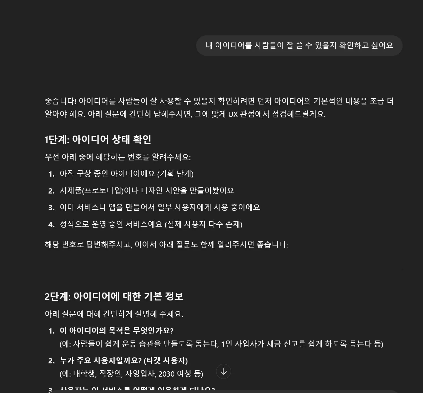
한국어 텍스트가있는 검은 색 화면
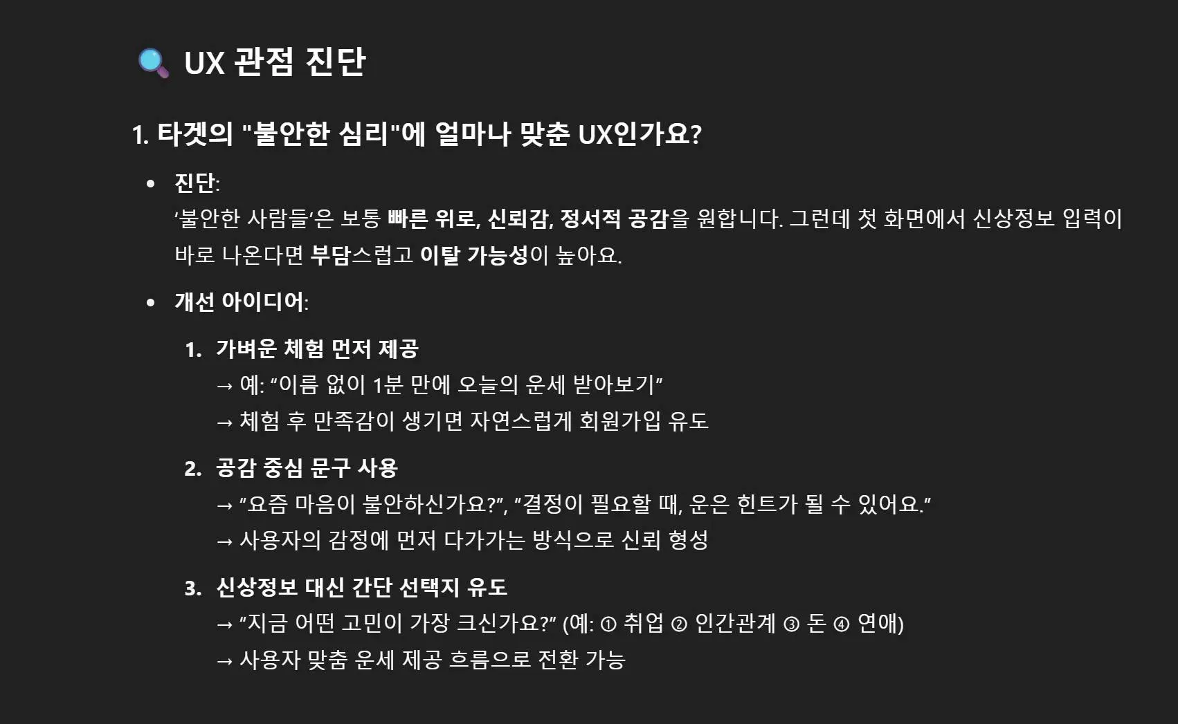
한국어 텍스트가있는 검은 색 화면
공개범위를 몰라서 일부만 편집해 올리자면, 저는 UX UI에 대해 모르지만 GPT를 자주 사용했기에, 예상되는 답변이 있었습니다. 그러나 스터디장님이 커스텀하신 UX 진단소는 제가 생각하지 못한 명쾌한 해답을 줬기에 신선하고 좋았습니다.
UX/UI Builder
검은 색 화면에서 한국 앱의 스크린 샷
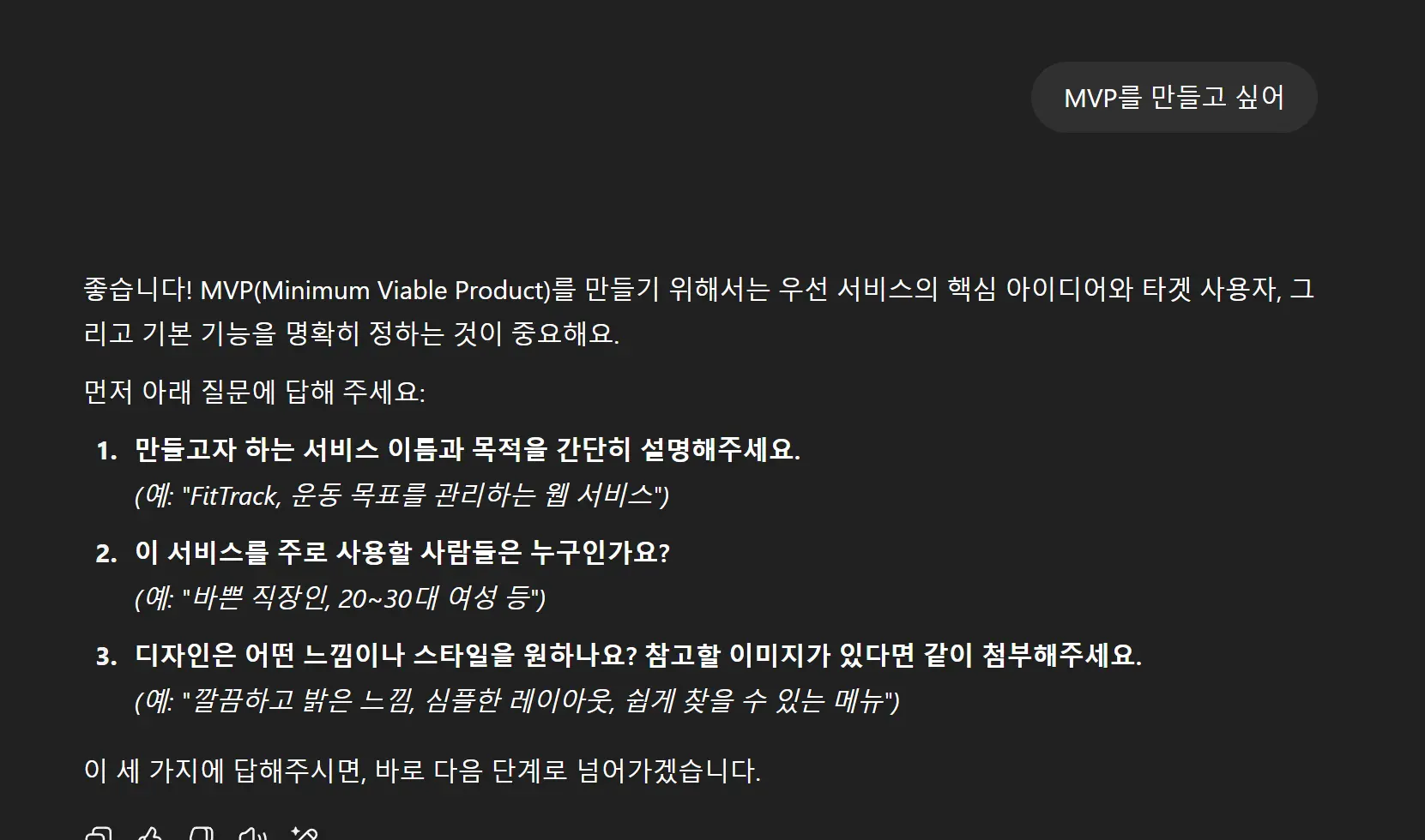
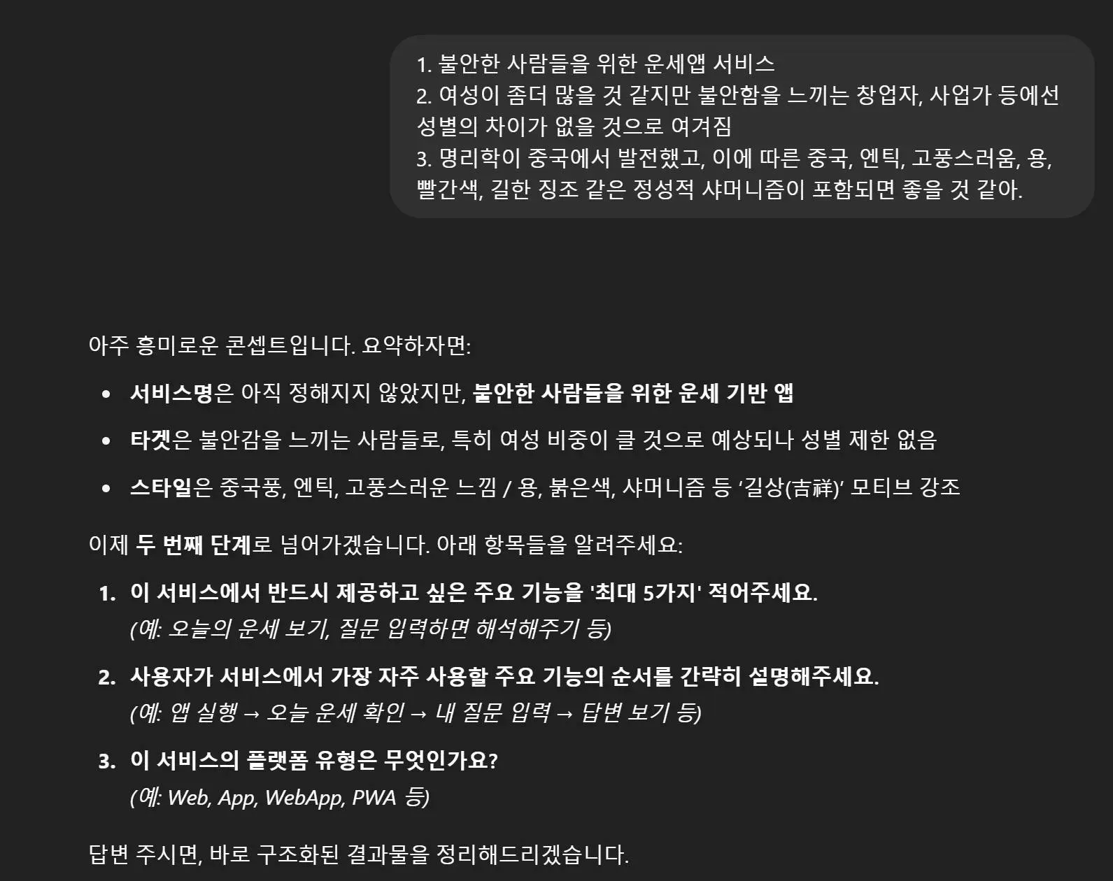
한국어 텍스트가있는 검은 색 화면
한국어 앱의 스크린 샷
이 역시 스터디장이신 Diane님께서 커스텀한 GPT입니다. 제가 심미안에 자신이 없었기에 프롬프트가 시키는 대로 할 생각이었는데, 가이드가 있으니 좋았습니다.
Figma Make
출력물을 그대로 Figma Make에 넣었습니다.
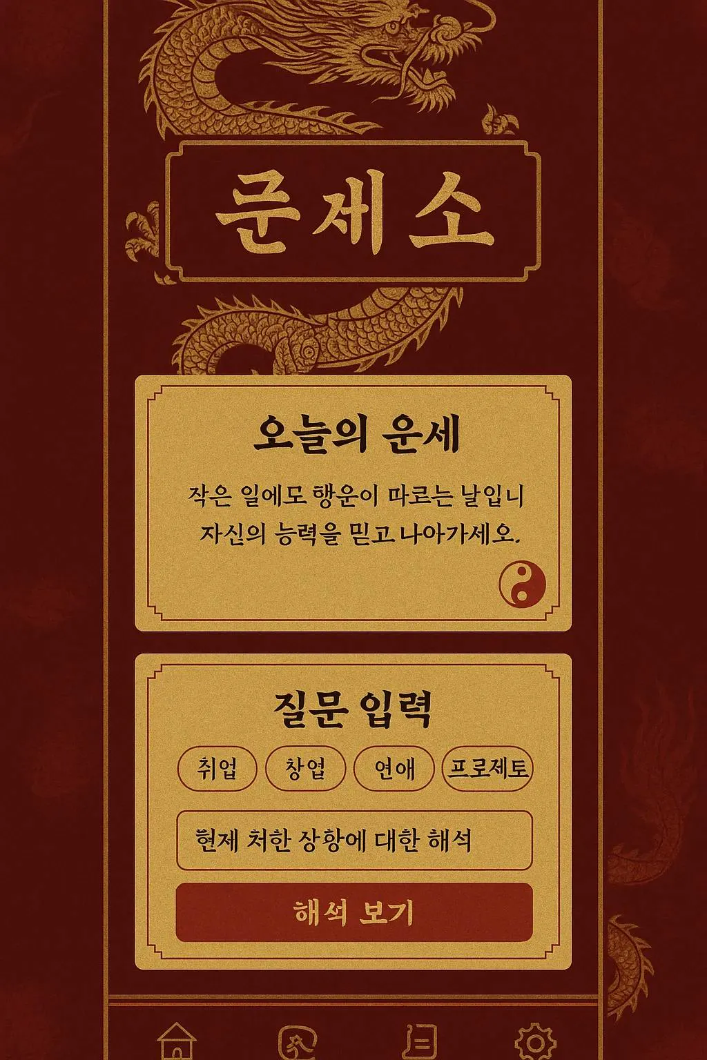
컨셉 이미지가 맘에들어서 이미지와 연관된 프롬프트를 다시 짜달라고 했습니다.
UI / Visual Design Prompt (for “운세소”)
Reference Image: #ref_image ← attach the dragon / red-gold antique mock-up here
• Task: Design a WebApp / App interface for a fortune-telling service called “운세소”.
• Target Users: People who feel anxious (e.g., founders, entrepreneurs, career-changers).
• Core Mood: Chinese-inspired antique aesthetic with strong symbols of luck.
• Must-have Visual Motifs: golden dragon, red-and-gold palette (#8B0000 / #FFD700), silk textures, parchment cards, calligraphic brush typography.
• Avoid: modern “startup-style” UI (no flat pastel blues, no glossy gradients, no playful rounded icons).
• Navigation: bottom-tab bar, 5 icons (Home, Ask, Response, Dream, History) using Eastern spiritual glyphs.
• Animations: subtle fluttering flame on Home fortune card, scroll-unroll transition when showing responses.
Key Screens & Components
Home – “Today’s Fortune” scroll-like card (uses colors & typography from #ref_image).
Ask a Question – stepper: select anxious topic → text input → “Get Insight” button (crimson with gold bevel).
Response – parchment card that displays LLM-generated advice. Include small yin-yang stamp bottom-right.
Dream Interpretation – input dream keywords, result appears as stamped dream scroll.
History View – vertical timeline of past questions; each entry uses mini parchment chips.
Design Constraints
Use the reference image (#ref_image) for overall color balance, texture feel, border style, and icon strokes.
• Background: deep red woven-silk texture; overlay faint dragon watermark.
• Typography Pairing: Traditional serif/brush headline + legible modern sans body (e.g., Noto Serif KR + Noto Sans KR).
• Touch Targets: ≥ 48 px; maintain high contrast for accessibility (WCAG AA).
Deliverables
High-fidelity mock-ups (Figma frames 390 × 844 and 1440 × 1024).
• Design tokens: colors, fonts, radius, shadows.
• Motion spec (GIF or Lottie) for flame & scroll animations.
Use #ref_image as the primary style reference. Sample components should visually match its ornate borders, gold linework, and aged-paper texture.
컨셉 이미지가 상당히 맘에 들었는데, 결과물은 다소 아쉬웠습니다.
스터디에서 진행했던 픽셀아트 + 자기소개서 프롬프트의 조합과 비교했을때, 입력 프롬프트의 양과 질이 많은 것을 좌우한다는 생각이 들었습니다.
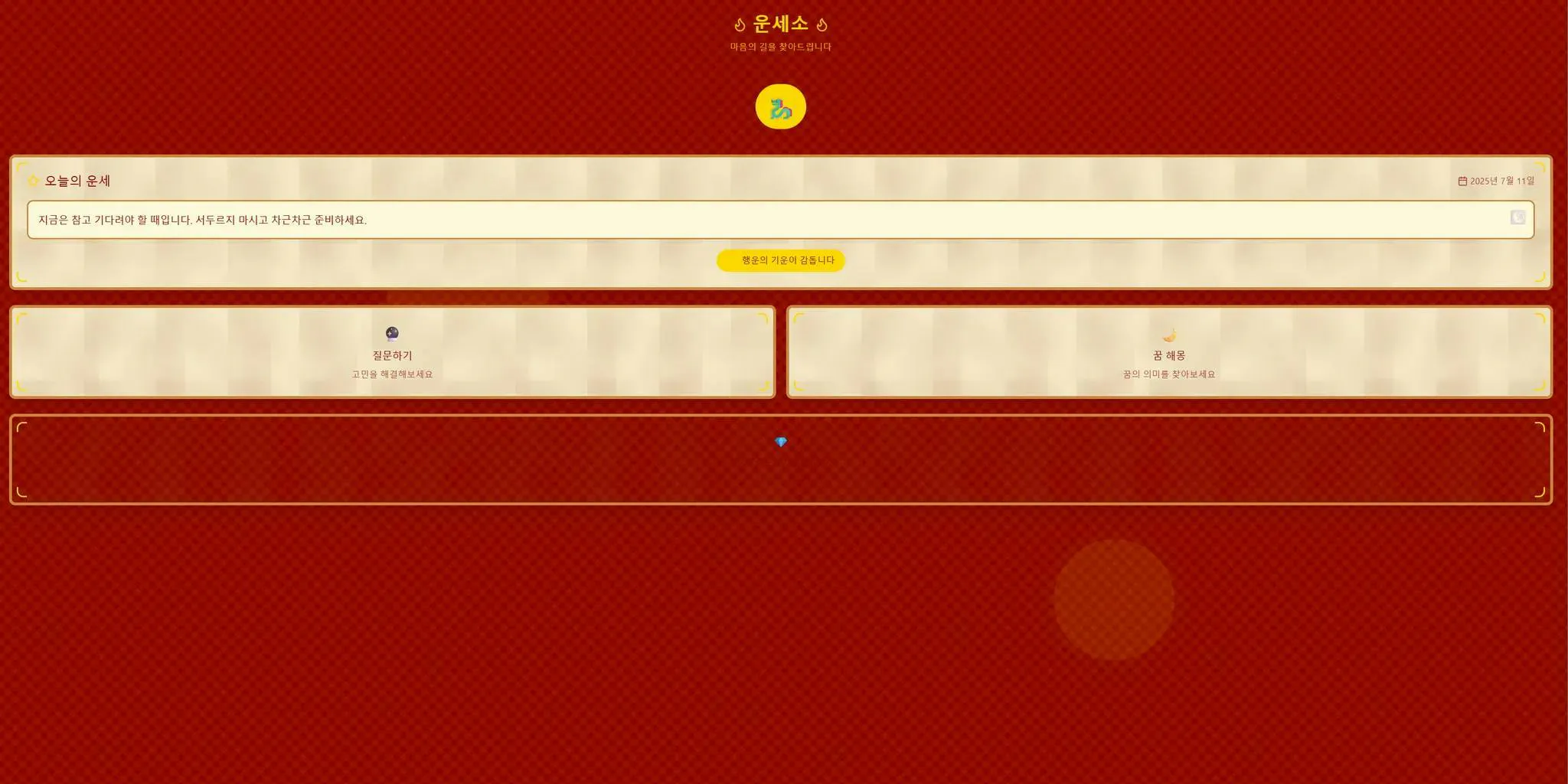
많은 버튼이있는 빨간색과 노란색 화면
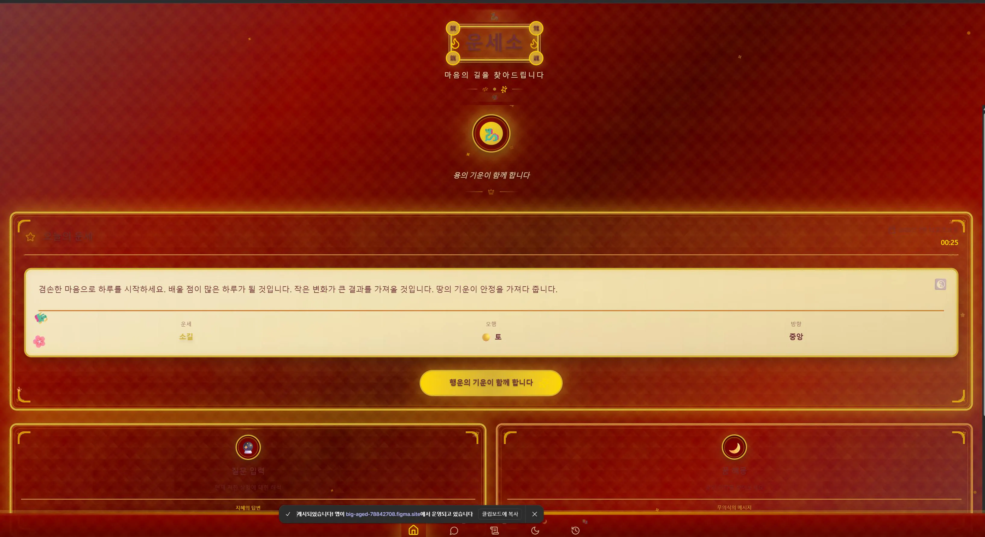
이미지 한번 더넣고 만든 버전
빨간색과 금 배경이있는 컴퓨터 화면의 스크린 샷
